A Color-Forward Invitation Suite with Swell Press
We’ll always love timeless paper goods, but there’s something especially exciting about an invitation suite that isn’t afraid to have a little fun.
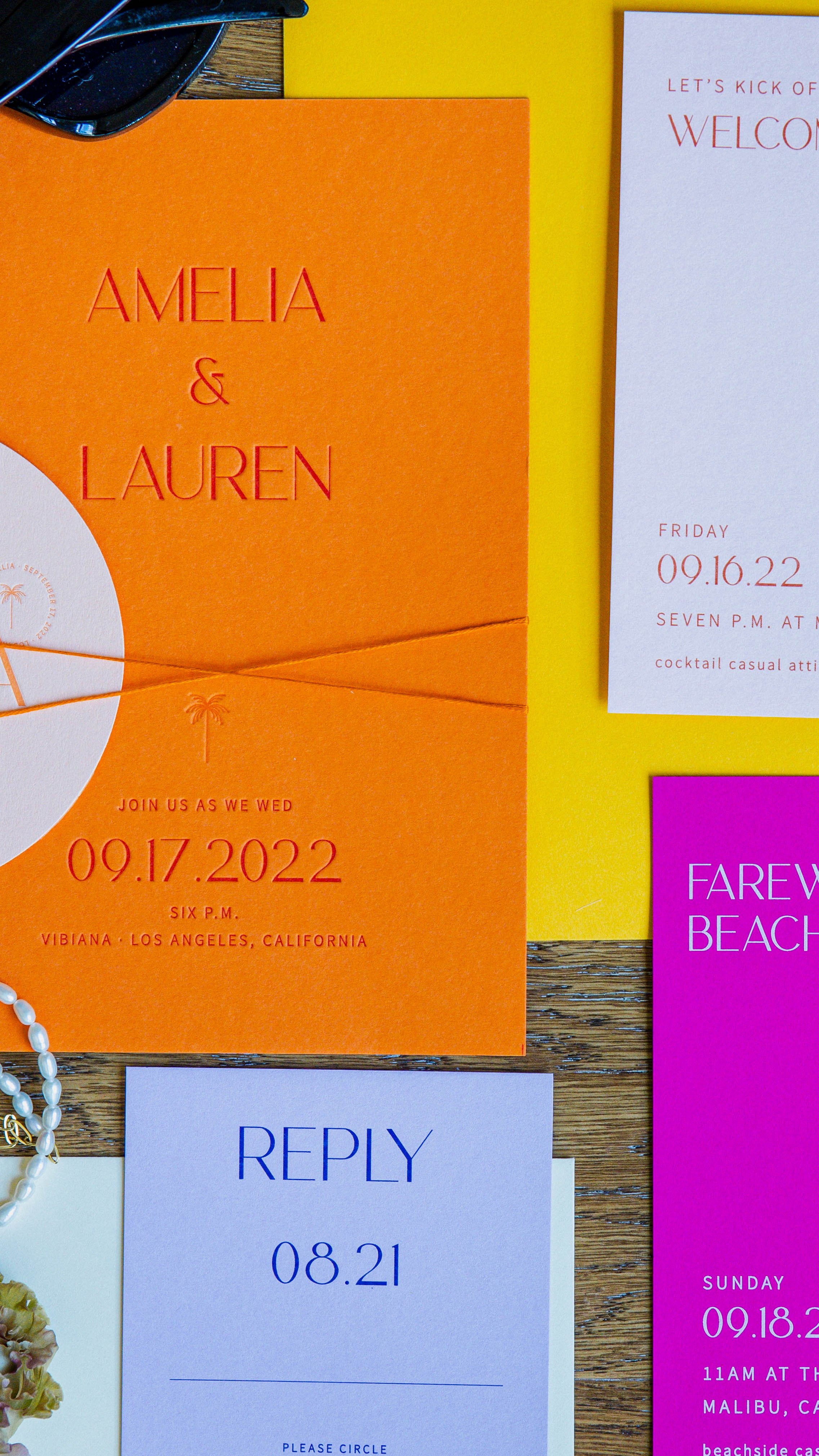
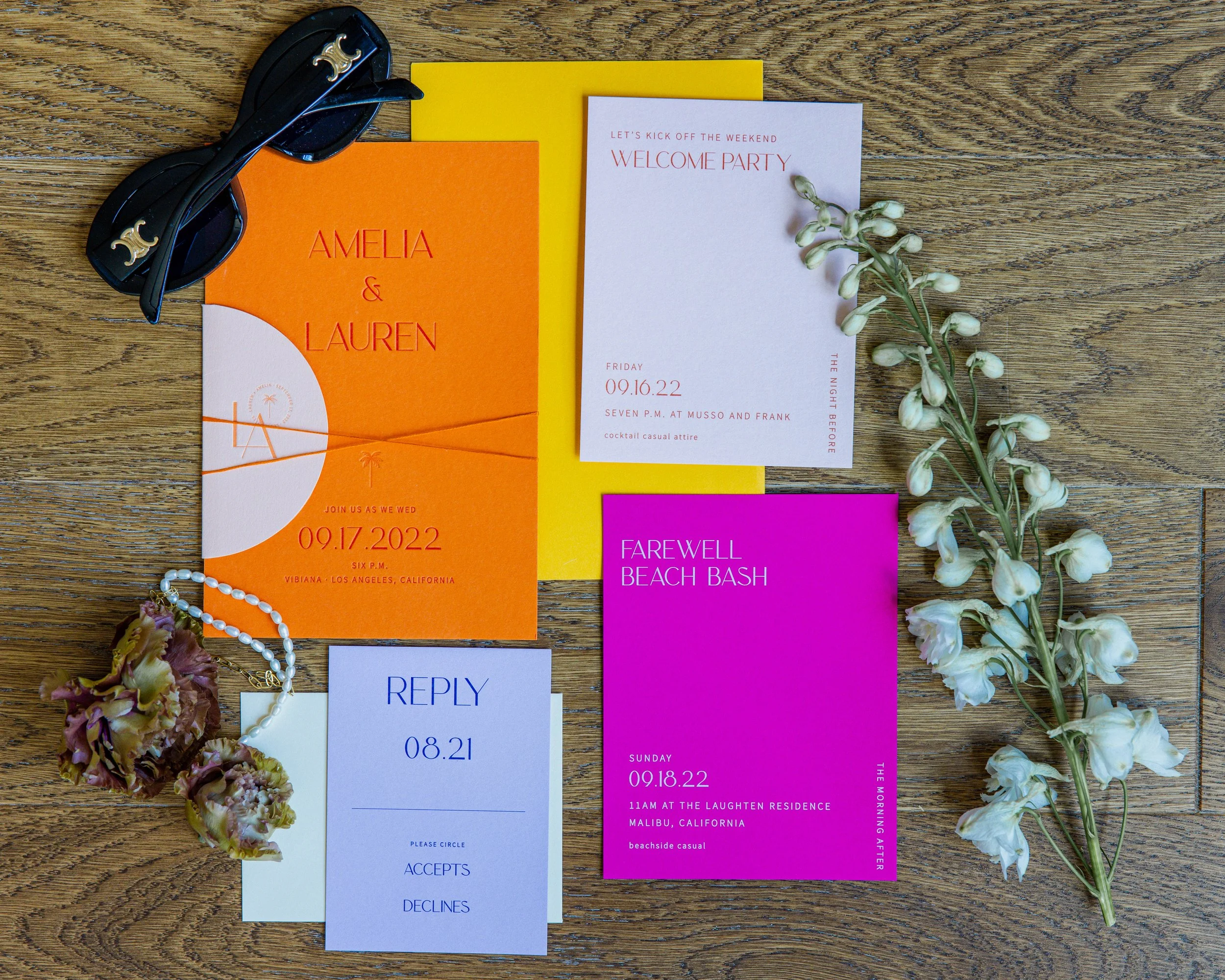
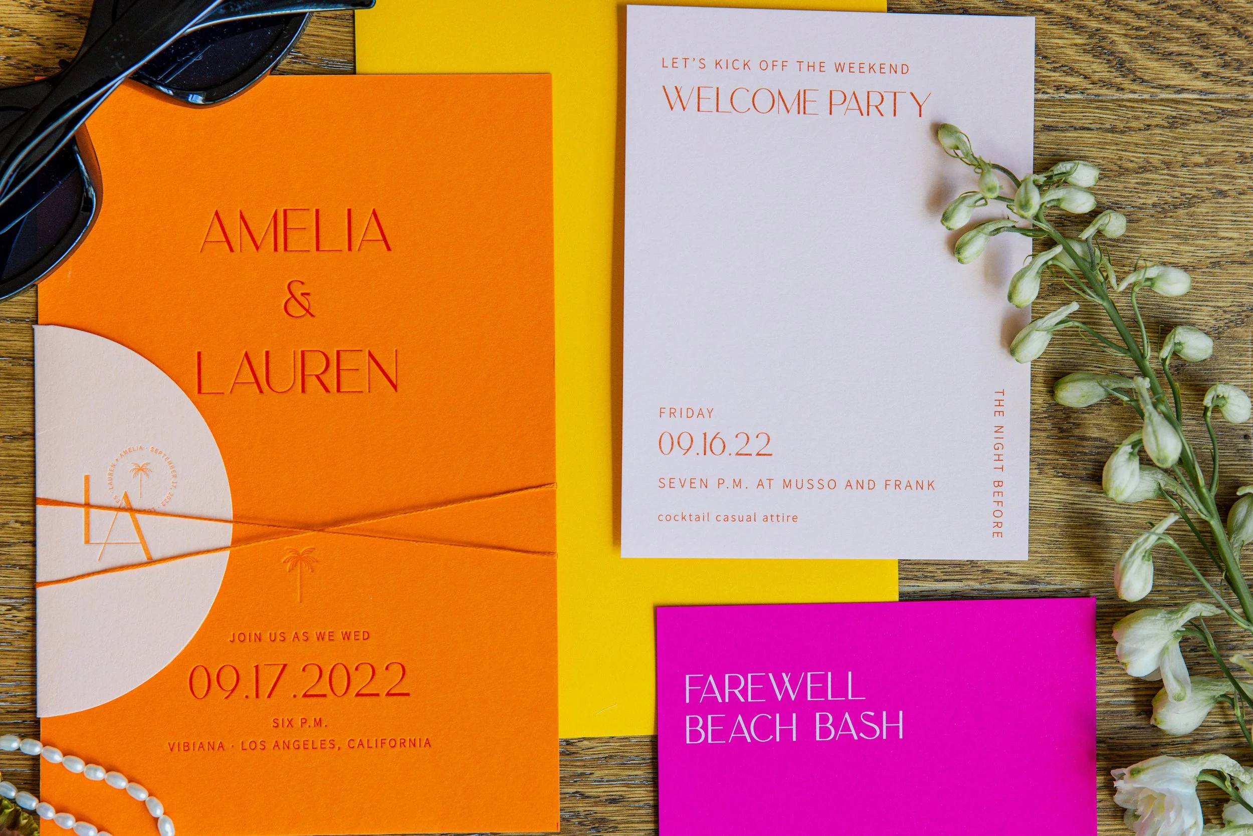
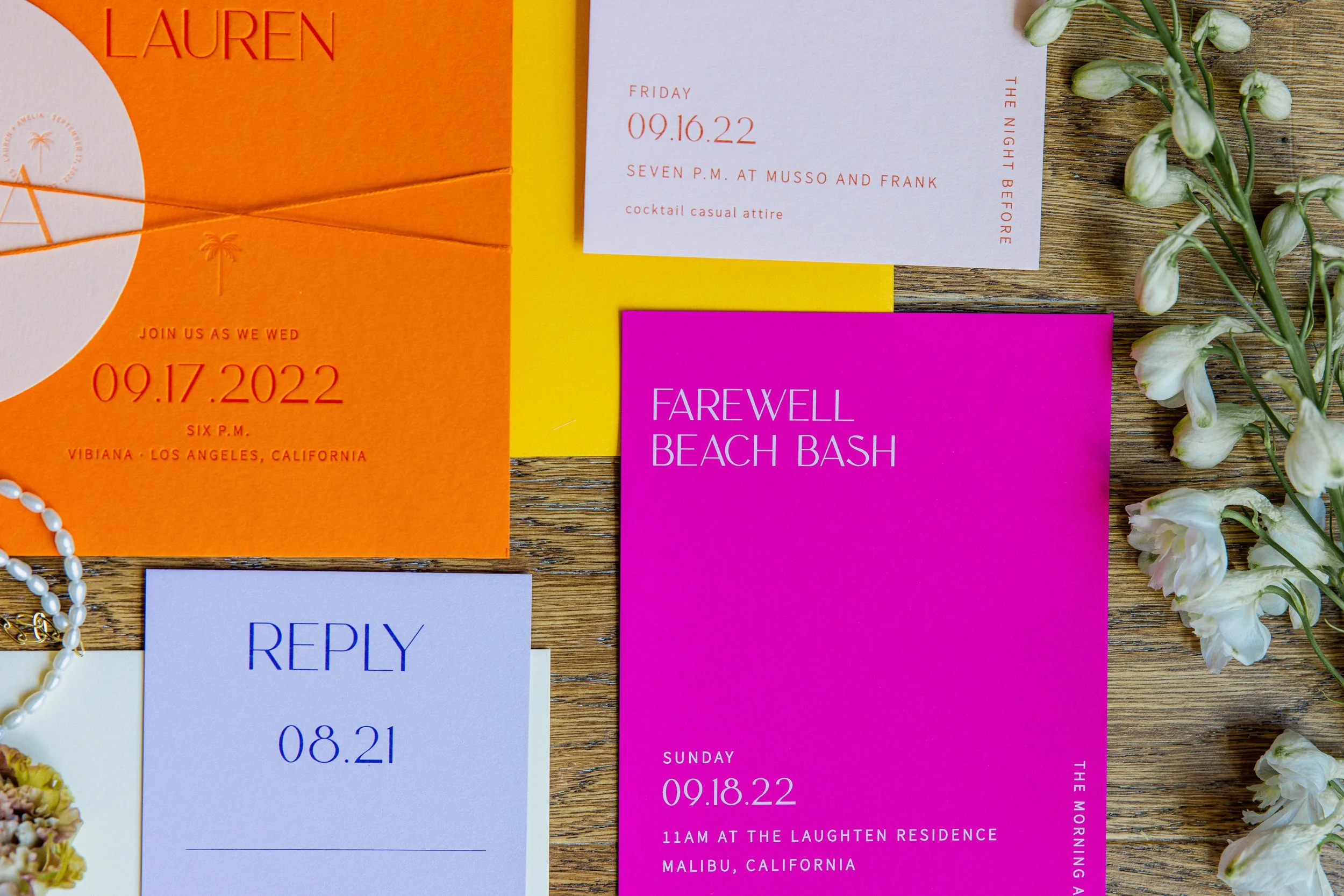
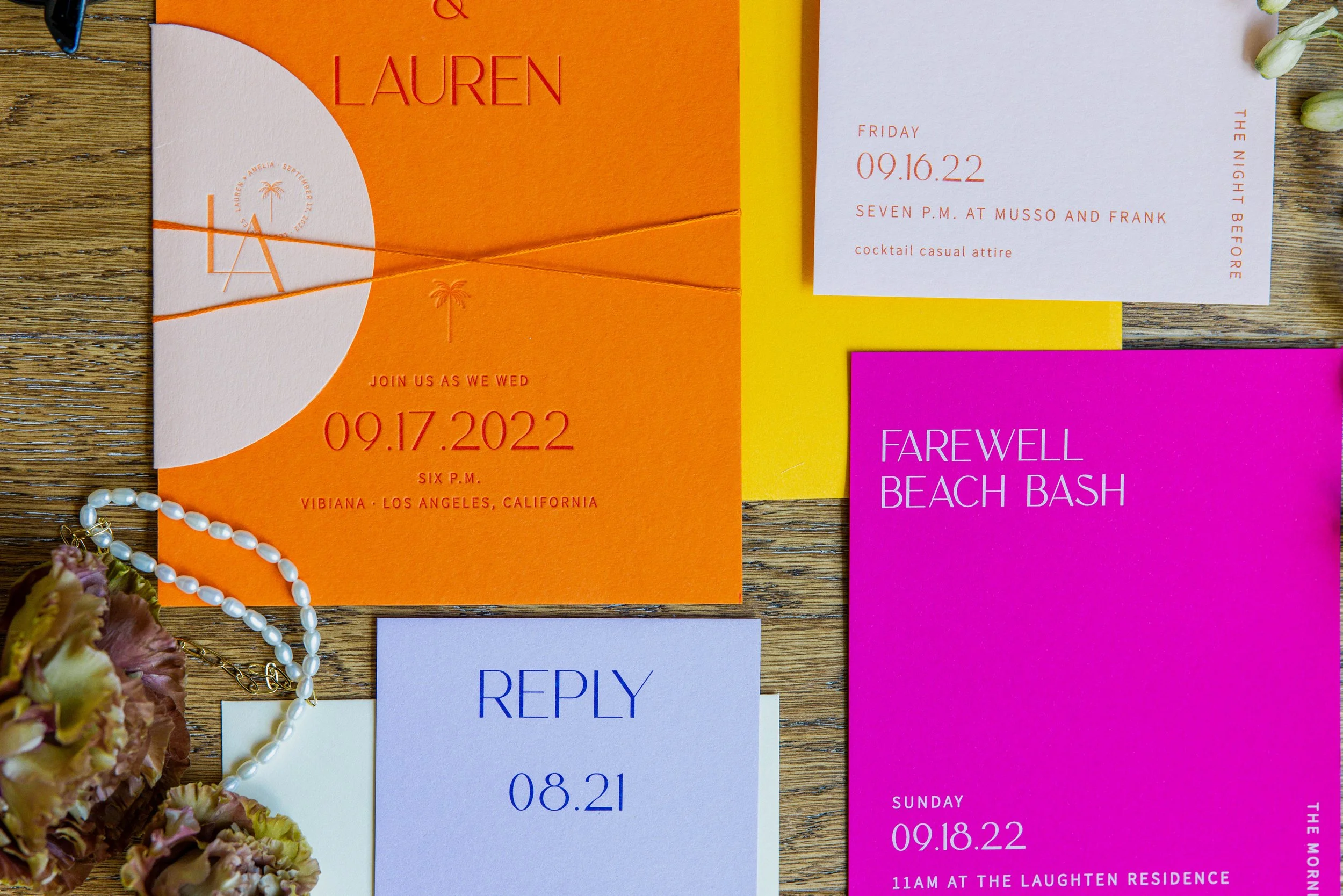
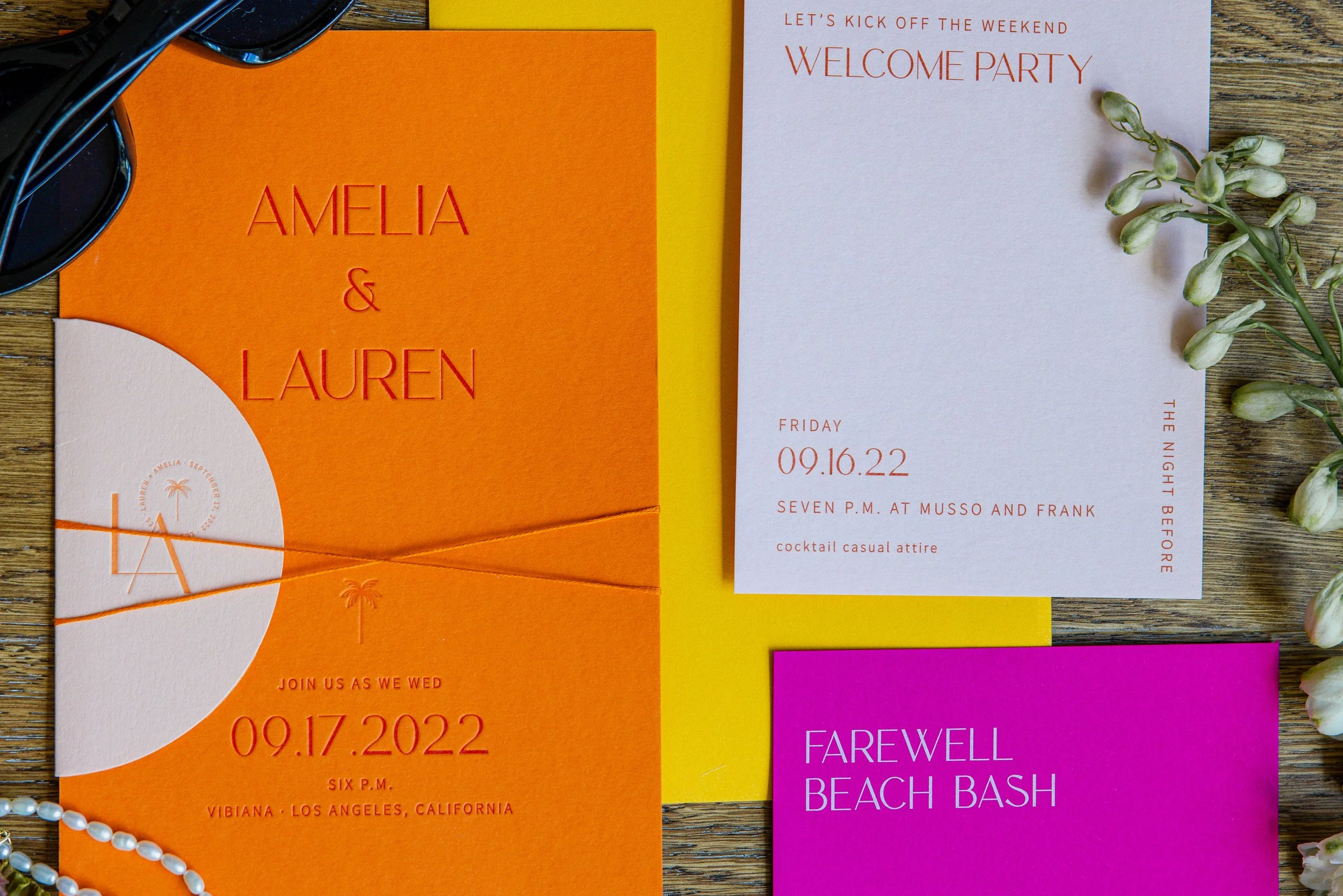
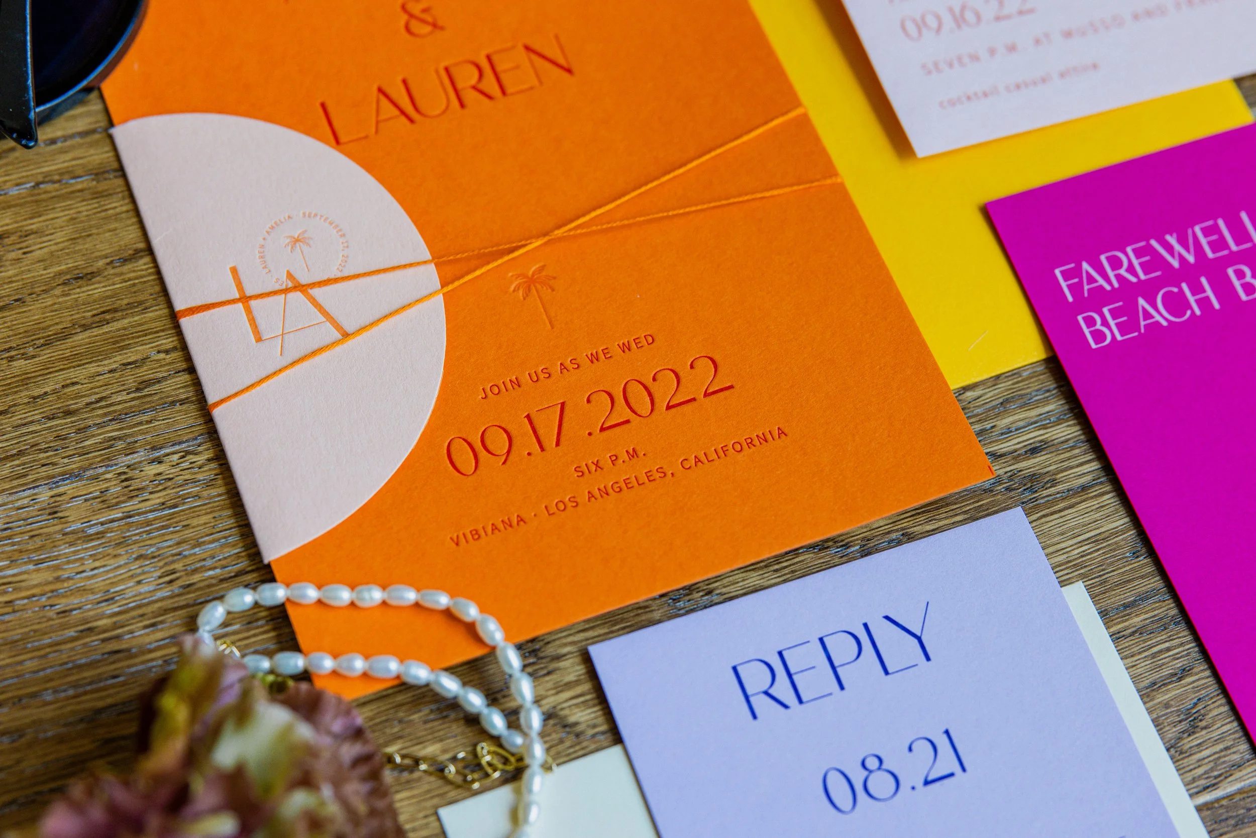
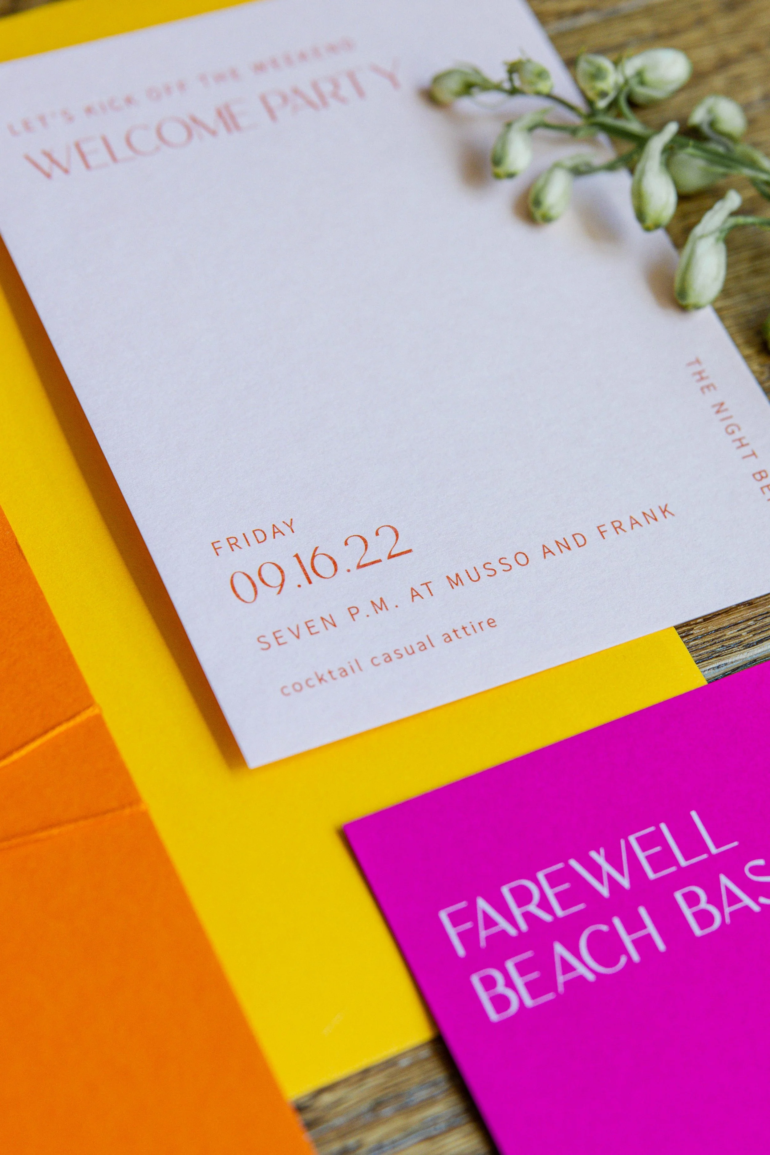
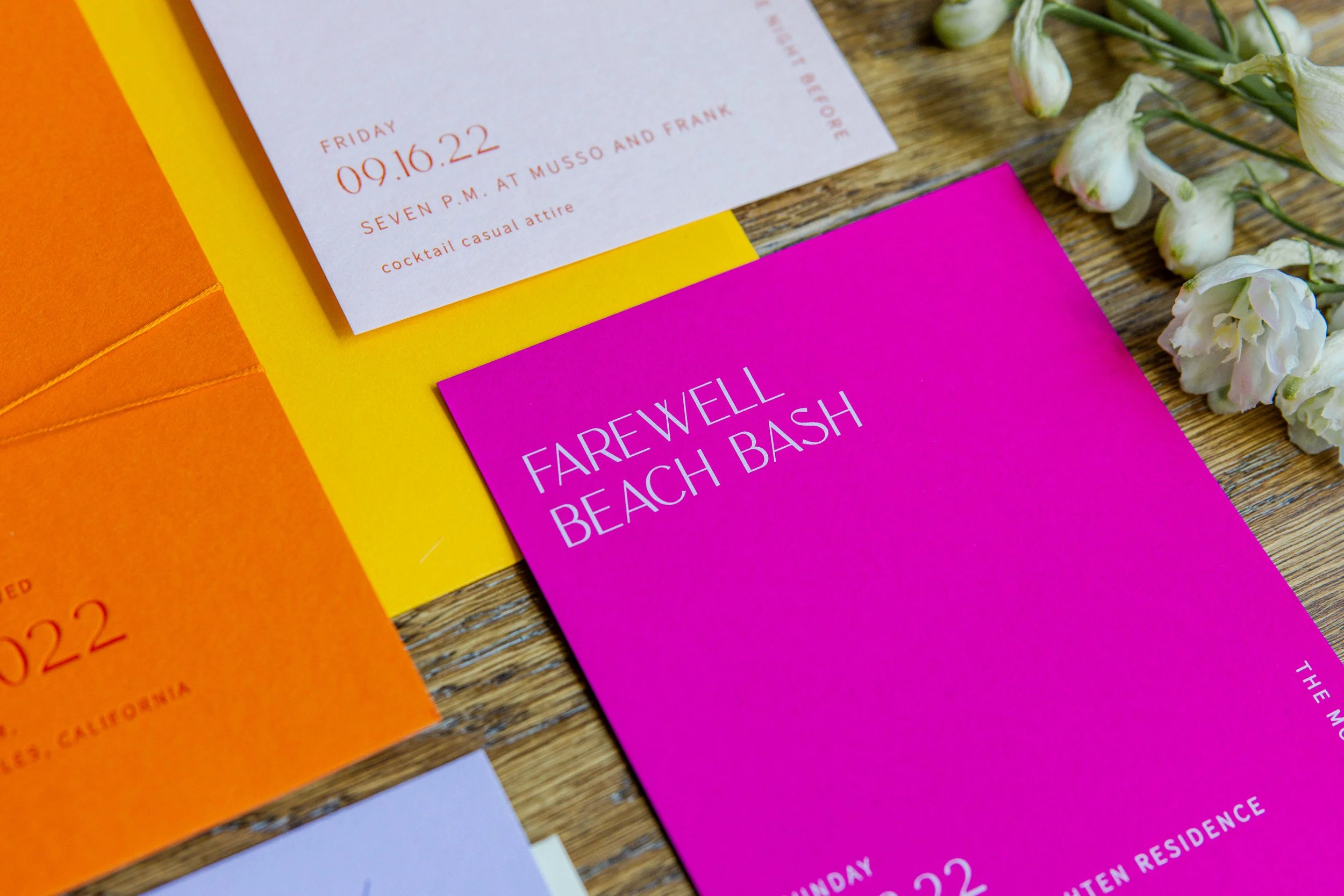
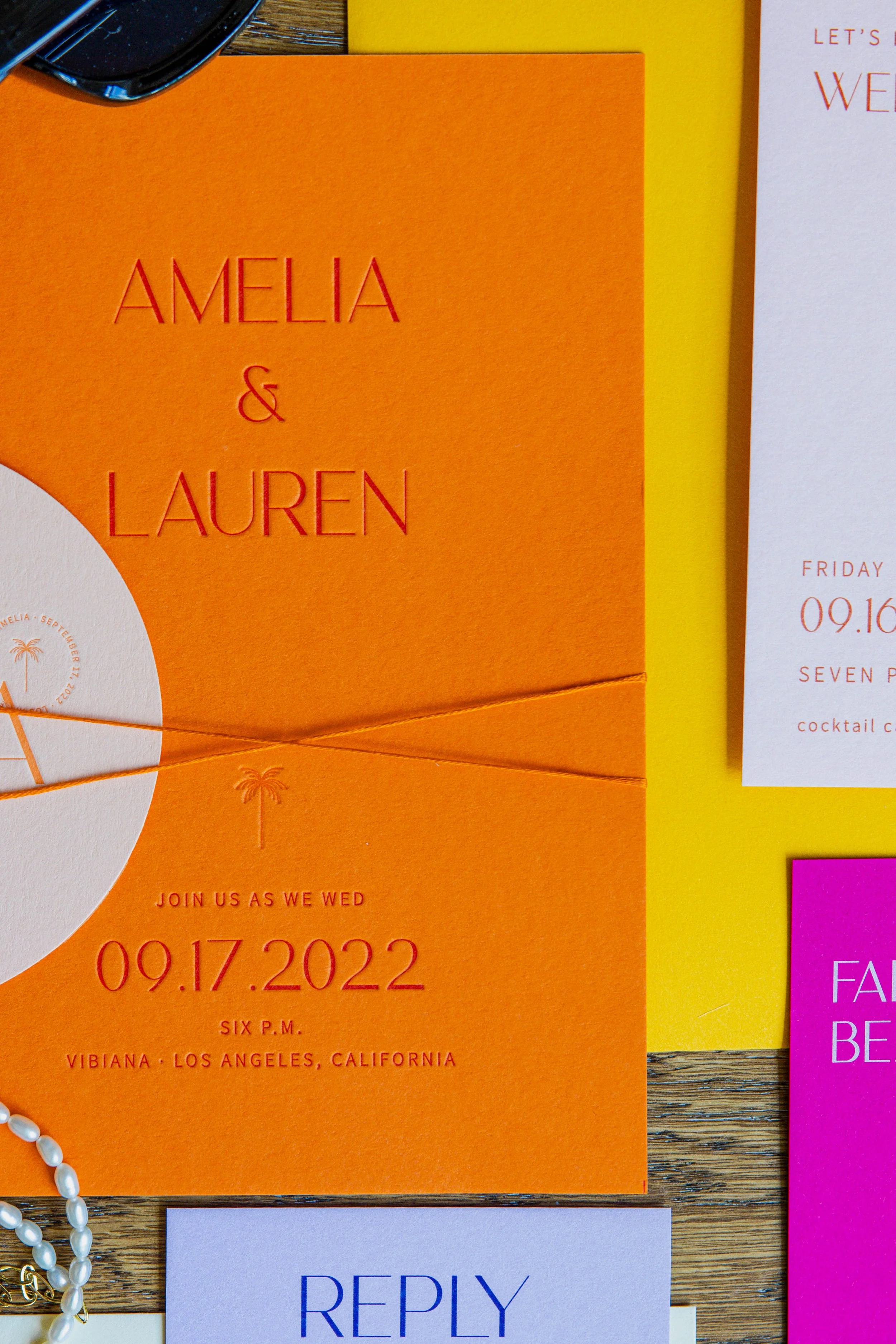
Designed by Swell Press, this suite makes a statement from the very beginning with a vibrant mix of orange, sunny yellow, electric pink, and soft lavender. Clean typography and graphic details balance the bold palette, giving each piece a modern, elevated feel without losing its playful personality.
We especially love how each event within the wedding weekend was given its own distinct look. From the saturated orange main invitation to the softer welcome party card, lavender RSVP, and punchy pink farewell piece, every element feels unique while still belonging to the same visual story.
From Paper to Party
As wedding planners, we love when paper goods are fun, bold, and full of personality because they give us so much to play with as the rest of the wedding design comes together.
Colors and details introduced in an invitation suite can become inspiration for florals, linens, signage, tabletop pieces, and other thoughtful moments throughout the celebration. It doesn’t have to be an exact match. Instead, we can pull from the overall palette and visual language to create subtle connections that make the entire wedding feel cohesive and intentional.
This suite by Swell Press is the perfect reminder that your invitations are more than a way to share the details. They’re the very first glimpse guests receive into the celebration to come.